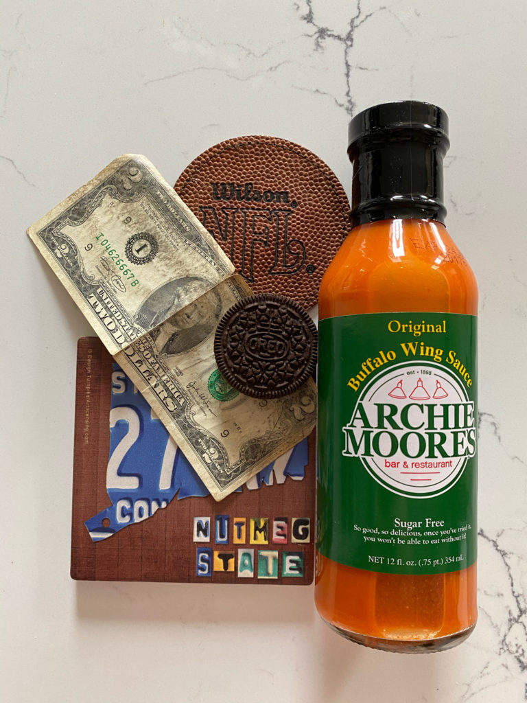
1. Buffalo Sauce – By far my favorite thing to put on food and I basically put it on everything. I get it from my favorite restaurant back home that has the best wings you’ll ever have.
2. Connecticut coaster – I have lived in CT for my entire life and I love it there. Always something to do and I have great friends and family back home
3. $2 Bill – I have kept this $2 bill in my wallet for probably around 5 years. It is just something that I don’t plan on getting rid of and I like it always being close to me. I will also never spend it even if I need a couple more bucks to buy something, I just won’t get it.
4. Double Stuf Oreo – I love Oreos more than anything, I have an endless supply with me at all times. I think I’ve eaten them since Kindergarten and had them every day in my packed lunch. I even wrote my College essay on Oreos.
5. Football coaster – Football has always been my rock in life. I’ve been playing tackle football since 2nd grade and continue to play here. My whole life revolves around football and this is the first fall I haven’t played in 12 years since the season got canceled. I also love watching football games, college or NFL, and my favorite team is the Green Bay Packers.

I think your picture was very well thought out. It has a lot of character and each object has something that draws my eye to it. For instance, the sauce is such a bright contrast to the rest of the items it really stands out but at the same time ties everything together. However, I would’ve had liked to see how it would look without being on a white background just because I don’t think the white matches the theme of the objects. Your objects seem very rugged and kind of casual but the white background is so perfect and pristine it draws attention away from the objects. Maybe with a darker background the objects would seem more center stage in the picture.
Good balance of objects. They all seem to be arranged to highlight the wing sauce, and even though it is a very strong color and the largest object in the arrangement you balanced it well. As someone mentioned in class there is a secondary theme of circles and another of rectangles. Both shapes work well together and placing the $2 bill at a diagonal was a good choice. And as we also mentioned in class the grey veins of the stone really complement the arrangement. Nice clear photograph. The slight lilt of the orientation goes well with your theme.