Evelyn Jiang
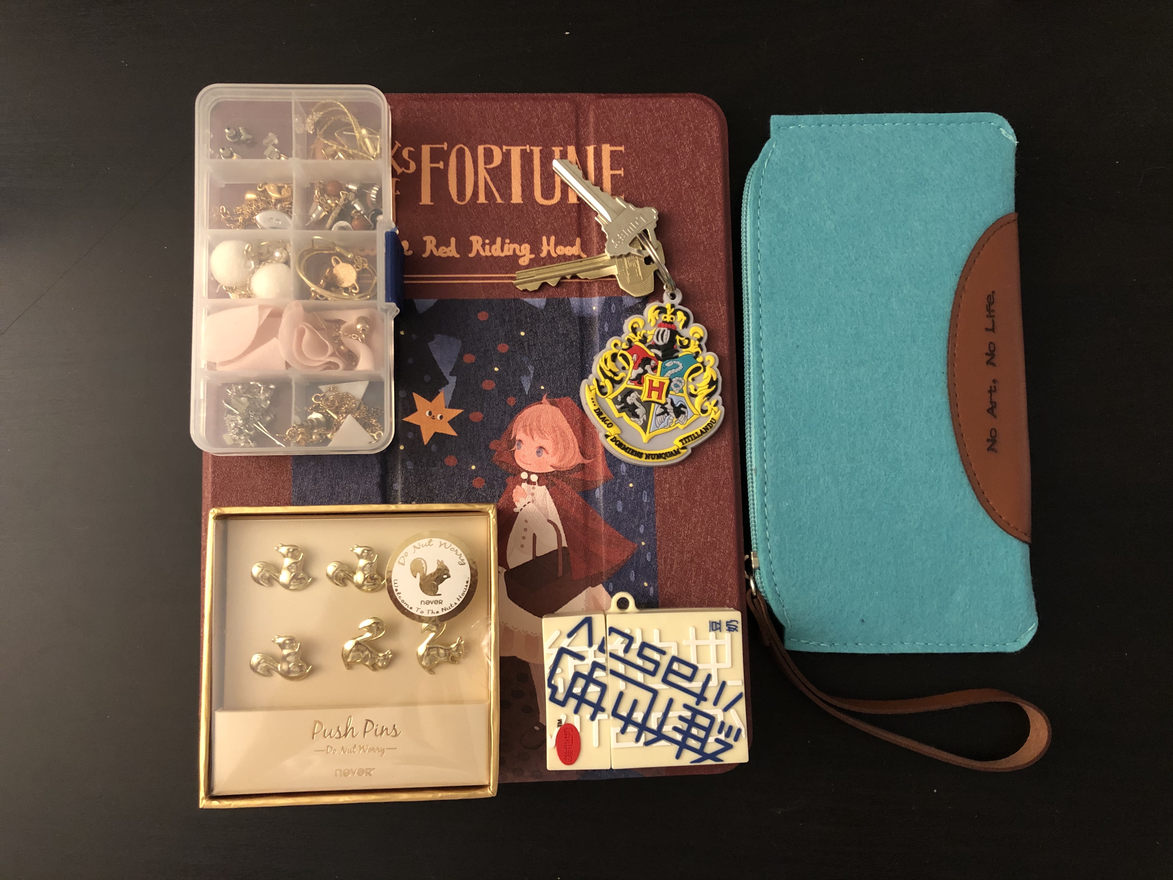
1. My iPad. I like using my iPad to draw, take notes, and watch videos. It has made things a lot easier in my life, so I always bring it with me whether is going to classes or traveling.
2. Earing box. I love collecting earrings although I might not wear earrings all the time. When I travel or going back to LA, I always pick a few pairs of my favorite earrings and put them in this box and bring them with me.
3. Squirrel pins. I love taking pictures and pin them on the wall. When I was living on campus, I’ve used those squirrel pins to pined pictures and artworks on the wall of my dorm. It made me feel nice to see my favorite pictures and artworks on the wall with pretty pins.
4. Harry Potter keychain. The keychain was my birthday present from my younger sister, and it was the first gift I got from her. She told me to use it when I go to school so every time when I see the keychain, I can think of her.
5. My AirPods. I love listening to music when I walk home from school or when I am working. I must bring my AirPods when I go out.
6. Pencil bag. I got this pencil bag from my freshman year’s roommate. She knew that I am an art student, so she gave it to me because it says, “no art, no life”. I now use it to put my color pencils.
I feel like you can prevent having all square/rectangular shapes if you had some of your earrings or squirrel pins out of the box and arranged around the other objects.
I like the similarity between the objects in that they’re all rectangular, but I would like to see a little less structure. Maybe perhaps having the earrings coming out of the case. That could possibly animate the piece and give it a little personality.
The repetition of the rectangular objects gives a sense of harmony and balance to the arrangement. It would have been even more effective if the photograph was not distorted (we know the squirrel pin box is square). Also pay attention to the lighting. You might have implied a clear rectangle with out totally filling it, spacing out the objects a little keeping the outside perimeter straight with nice square corners. Good selection of colors and tones and a good description of the importance of the objects.