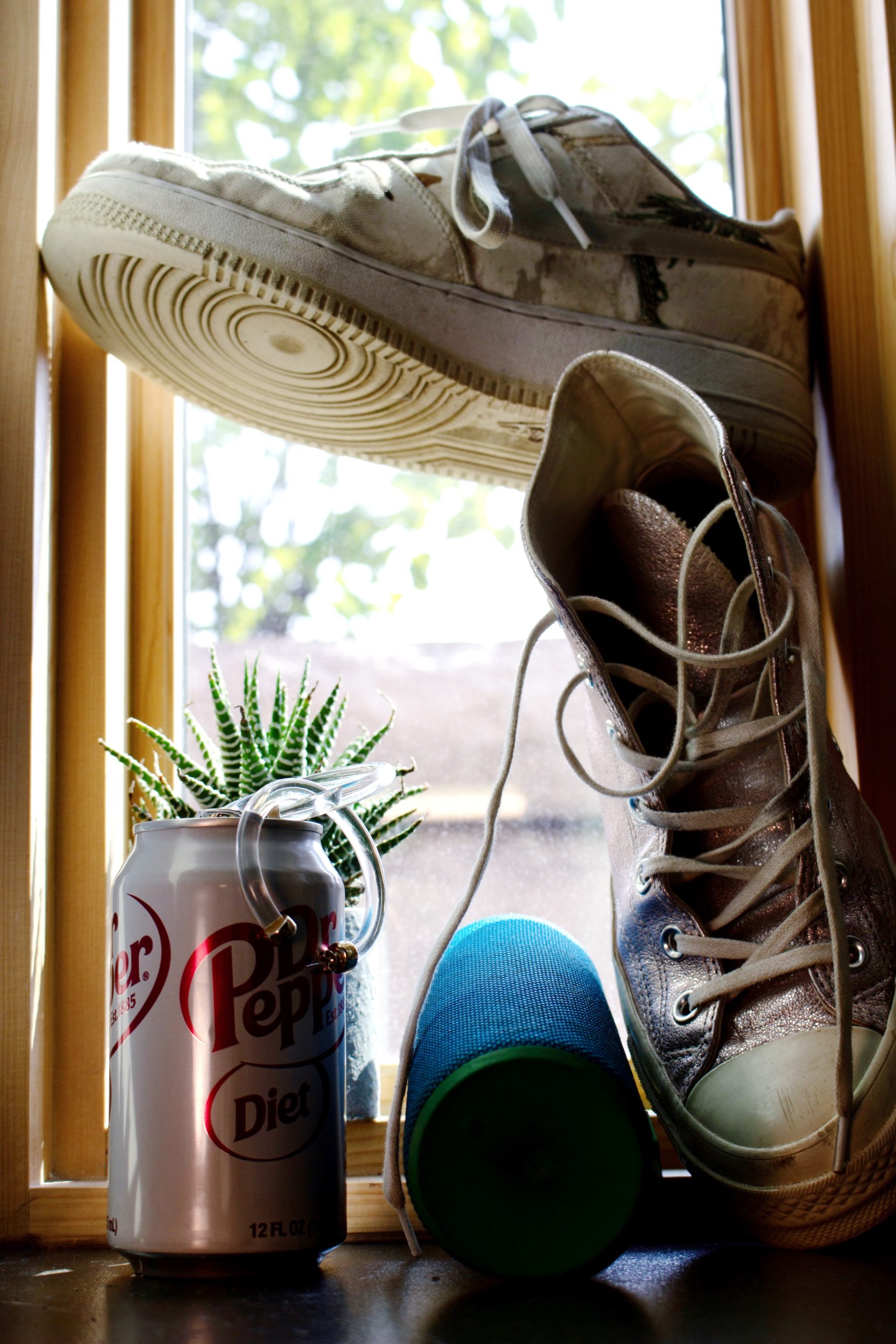
1.) Number one in my heart is my Diet Dr. Pepper… While admittedly it is a habit I’m trying to break, I live with a bunch of fellow DDP lovers, so I can’t resist cracking one open with them.
2.) The pair of clear hoop earrings are a current favorite of mine, but they also represent my love for jewelry (especially earrings). While my mom hates it, I do love getting new ear piercings every so often, and have been known to go to some pretty great lengths to get it done.
3.) The succulent in the back is about all my “green” thumb can handle. I love plants/flowers/anything from the earth, so it’s nice to keep some part of that in my apartment.
4.) My speaker is a big part of my life… I love listening to and discovering new music, especially with friends. Music has definitely kept me sane(ish) these past 5 months. My roommates and I can be found dancing to music in our apartment pretty much every night. If you have any good Spotify playlists let me know, always looking for new ones to follow!
5.) My sparkly pink converse were a game changer that came into my life last year. I bought them spur of the moment on sale and have never looked back. They keep life fun and remind me to enjoy the little things.
6.) Had to include at least one pair of Nikes. I’ve loved sneakers for as long as I can remember, and these are one of my favorite pairs.
7 (kinda).) I purposely chose to assemble all these objects by a window because I absolutely love being outside or at least having natural light pouring in. I spent the majority of my quarantine outside and really appreciated quiet spaces in nature.

I think that the shoe suspended above the Dr. Pepper was effective at creating a balanced composition. My eyes are immediately drawn to the negative space between the succulent and the shoe. I also think that showing the circular texture of the suspended shoe paired very well with the circles created by the hoop earrings and the soda can. Finally, I think that the natural light succeeded in creating a dramatic image that made the objects feel three dimensional.
The balance between the characteristics of the pieces and the actual balance of the shoes in this image is very satisfying and makes it seem cohesive even though the objects are all vastly different. I do wish that the speaker was a little more illuminated, but at the same time, I like the lighting of the rest of it a lot.
I really like the background of your picture. The window makes the picture bright and the view outside the window is also fit the whole picture. What’s more, the idea of putting one shoe on the other makes the picture full and special. It is a really good composition.
Kate, great idea to situate your objects in front of the window. The balance you achieved with the shoes is quite dynamic, lending a sense of movement to your whole piece. It feels like the shoes would rather be outside as well! Nice balance between floating forms and grounded forms. But the bottom of the photograph is a little dark. Perhaps supplement with a flash or with some lighting. Or even edit the photograph later. AND QUIT that DDP. It is terrible for you!